
Choosing a color palette is often the very first thing business owners do when creating their brand. However, there’s a lot more to think about than just picking colors that look nice or happen to be your favorite. In this post I’m going to break down the 3 factors that go into creating your brand color palette, the color psychology of each color, and 4 actions to take before deciding on your final color palette. Let’s dive in!
Three Factors of Your Brand Color Palette
1. Your Ideal Client
Always, always, always make decisions with your ideal client in mind. What would they want? What are they looking for? Which brands do they interact with?
What do they need from you? Someone who needs to be entertained will be attracted to a different brand than someone who is looking for something more serious like banking or healthcare.
2. Your Business Goals
Stop for a moment and think about where you want to end up. Do you know what you’re working towards? What value do you want to give to your customers? What do you want your brand to stand for? When someone thinks about your brand, what would you want them to immediately think of?
3. Your Business Personality
Lastly, think about your brand personality. How does your company interact with its customers? A lot of times, this is where your individual personality and preferences shine through. Oftentimes, you are very close to your ideal client, so your brand colors end up being your favorite colors. This is fine, AS LONG AS you have the strategy and facts to back it up. Again, make sure you’ve clearly defined your ideal client. Just because you love purple and red doesn’t mean they’re the best fit for your brand. Make sure you have reasoning to back up the colors you choose.
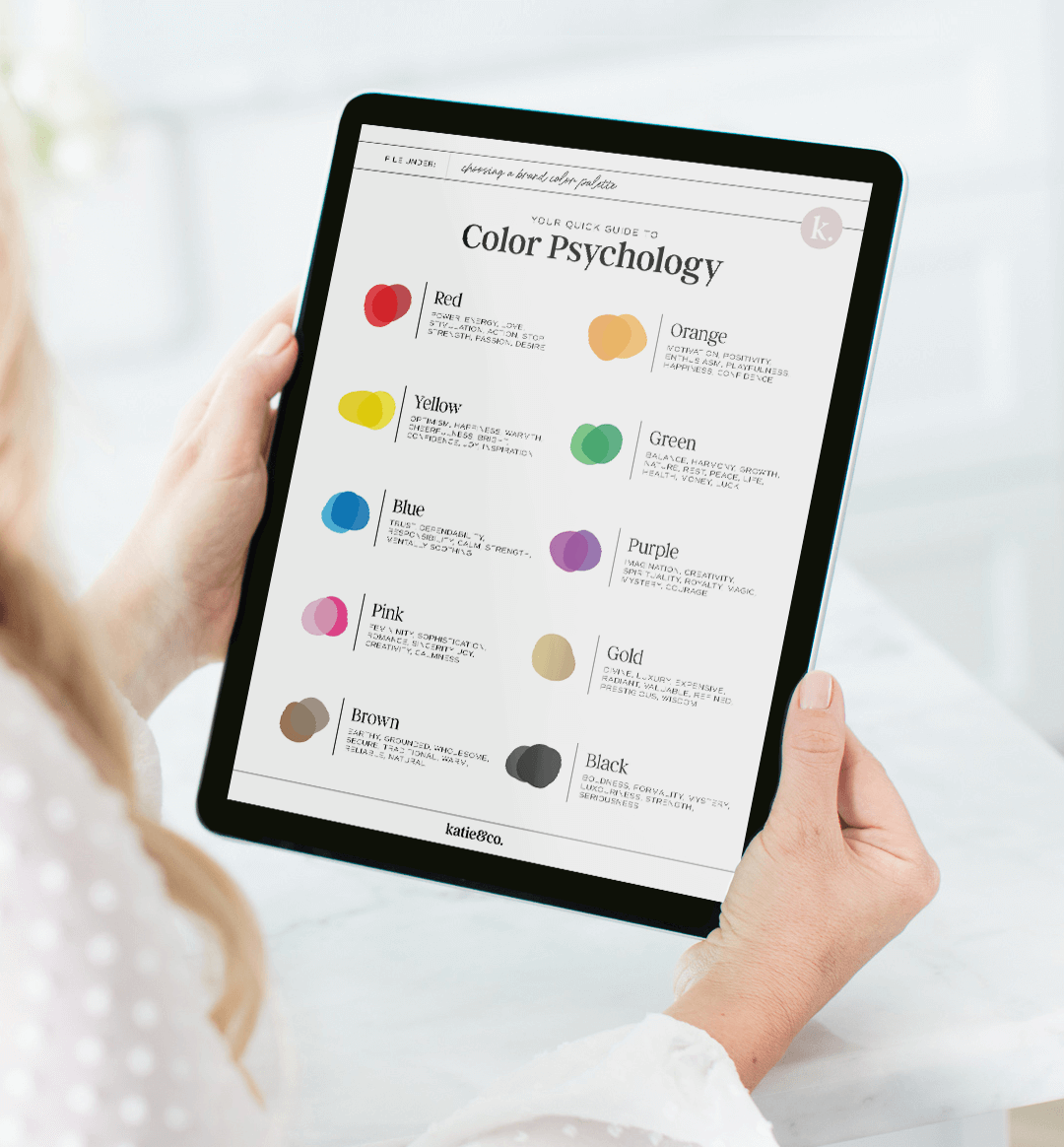
Color Psychology: The Meaning and Feeling Behind Each Color
Color is a tool to use in your business. It’s an opportunity to communicate certain feelings and meanings to your clients without them really taking notice. Use the right colors, and you’ll be able to appeal to your client. Choose the wrong colors, and your content can be easily ignored in a sea of marketing.
Read more about the meaning of each color below. (And scroll to the bottom of this post for a cute cheat sheet!) It’s my hope that this list will give you some ideas on what your brand palette is communicating to your customers!
RED: power, energy, stimulation, love, action, stop, strength
ORANGE: motivation, positivity, enthusiasm, playfulness, happiness, confidence
YELLOW: optimism, happiness, warmth, cheerfulness, bright, confidence, joy, inspiration
*Yellow is the easiest color to visibly see and the first color that infants respond to
GREEN: balance, harmony, growth, nature, rest, peace, life, health, money, luck
BLUE: trust, dependability, responsibility, calm, strength, mentally soothing
* Blue is often the most liked color of both men and women. Although, it is also one of the last colors to be seen
PURPLE: imagination, creativity, spirituality, royalty, magic, mystery, courage
PINK: femininity, sophistication, romance, sincerity, joy, creativity, calmness
GOLD: divine, luxury, expensive, radiant, valuable, refined, prestigious, wisdom
BROWN: earthy, grounded, wholesome, secure, traditional. Warm, reliable, natural
BLACK: boldness, formality, mystery, luxouriness, strength, seriousness
Click here to download a cute cheat sheet of color psychology!
4 Things to Do Before Choosing Your Brand Color Palette
1. Look at competitors
Check out the competitors in your space. This is NOT to copy or imitate them. Actually, it’s the exact opposite. Do you see a common trend happening in your industry? If most of your competitors are choosing similar colors, make sure you’re not picking the same ones! In fact, the more you can stand out the better. Differentiate yourself starting with your color palette.
2. Find a Photo that Matches Your Desired Aesthetic
It’s Pinterest time. Find a photo that just speaks to you and take note of which colors are included. Even better, create an entire board of photos you love and pay attention to the colors that are constantly showing up. Once you’ve found your one photo, use an app or website like Coolors to find the exact colors and create a palette.
3. Define the Hierarchy
Oftentimes we see color palettes as a collection of color swatches that are all the same size. However, if you look at a logo or a website, its not very common that each color is used equally. When choosing a brand color palette, it’s important to note which colors will be more prominent. When I’m choosing a palette for a client, I like to pick out 1-2 main colors, 2 secondary colors (or neutrals), and 2 accent colors. This helps you get a better idea of how your brand and website will really look, and helps you make sure these colors work well together.
4. Test, test, test
Once you think you’ve found the perfect palette, it’s time to test it out. Play with the colors. See how each color looks when next to the others. See what they look like when one color is text and one is the background. How does white text look on that color? What about black text? What does the color look like as a small object? How does it look as the background of a website? After playing through multiple scenarios, you may need to tweak the colors in order to create the perfect brand palette.
Have questions? Shoot me an email!
Check out more from the blog here.
Follow along for more business tips and tricks on Instagram!
Like this post? Save it on Pinterest!
")
")
